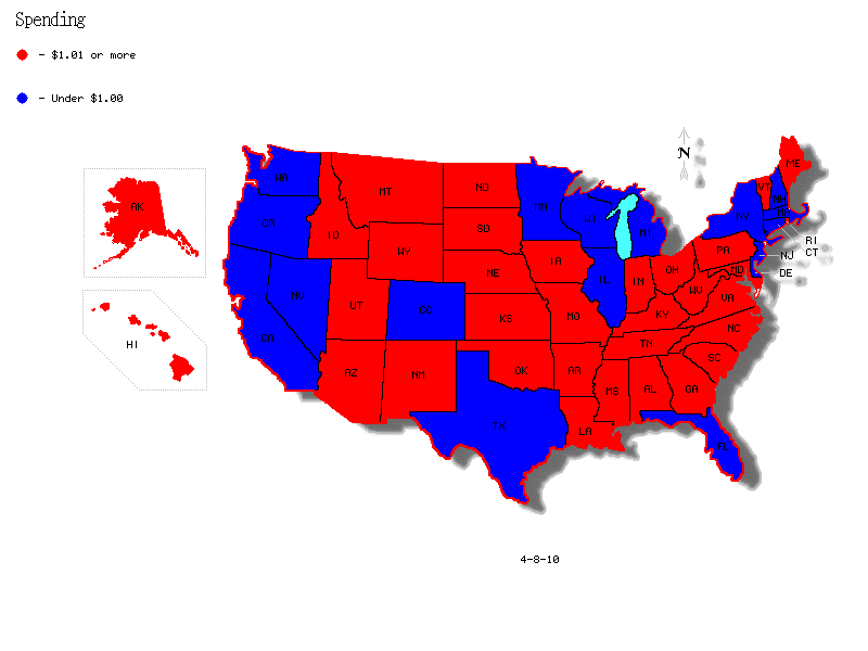
Perhaps more interesting is looking at where federal spending is directed. The red states in the map below are states which received more than $1.00 in federal money for every $1.00 in taxes paid by residents of that state. Blue states are states which received less than $1.00 in federal money for every $1.00 paid by residents of that state in taxes (information from a 2005 study by the Tax Foundation).

This one should look familiar:

Source: The Fourth Branch

No comments:
Post a Comment